Typesetting is hard
Let me do it for you.
Why hire a Typesetter?
You poured your heart into your book—don’t let poor design drive readers away before they’ve even made it to chapter two.
We’ve all picked up a book that felt wrong before we even started reading. Maybe the text was too cramped, the font hard to read, or the layout just… off. That’s not a reflection on the writing. That’s bad typesetting. And it happens more often than you’d think.
I specialize in making sure that doesn’t happen to your book.
What I do
Typesetting is about much more than just “making it look nice.” It’s about creating a seamless, intuitive reading experience—one where the design disappears and your words take center stage. I make deliberate choices about margins, fonts, spacing, and layout, all with one goal: readability.
From choosing the right trim size to eliminating visual distractions like word stacks, widows, and orphans, I take care of the technical details most readers never notice—unless they’re done wrong.
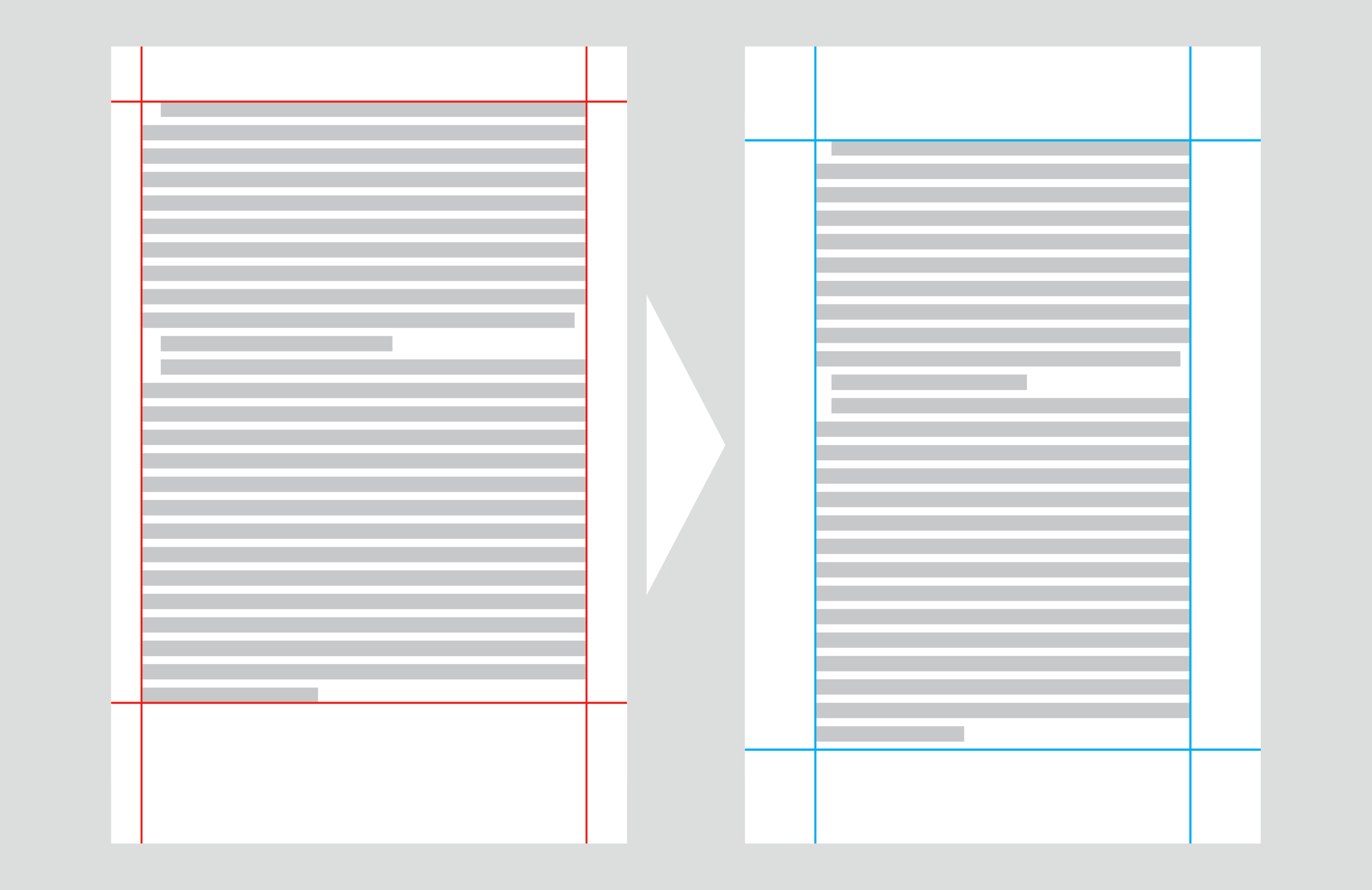
Page margins, trim size and headers all impact the way readers perceive your book.
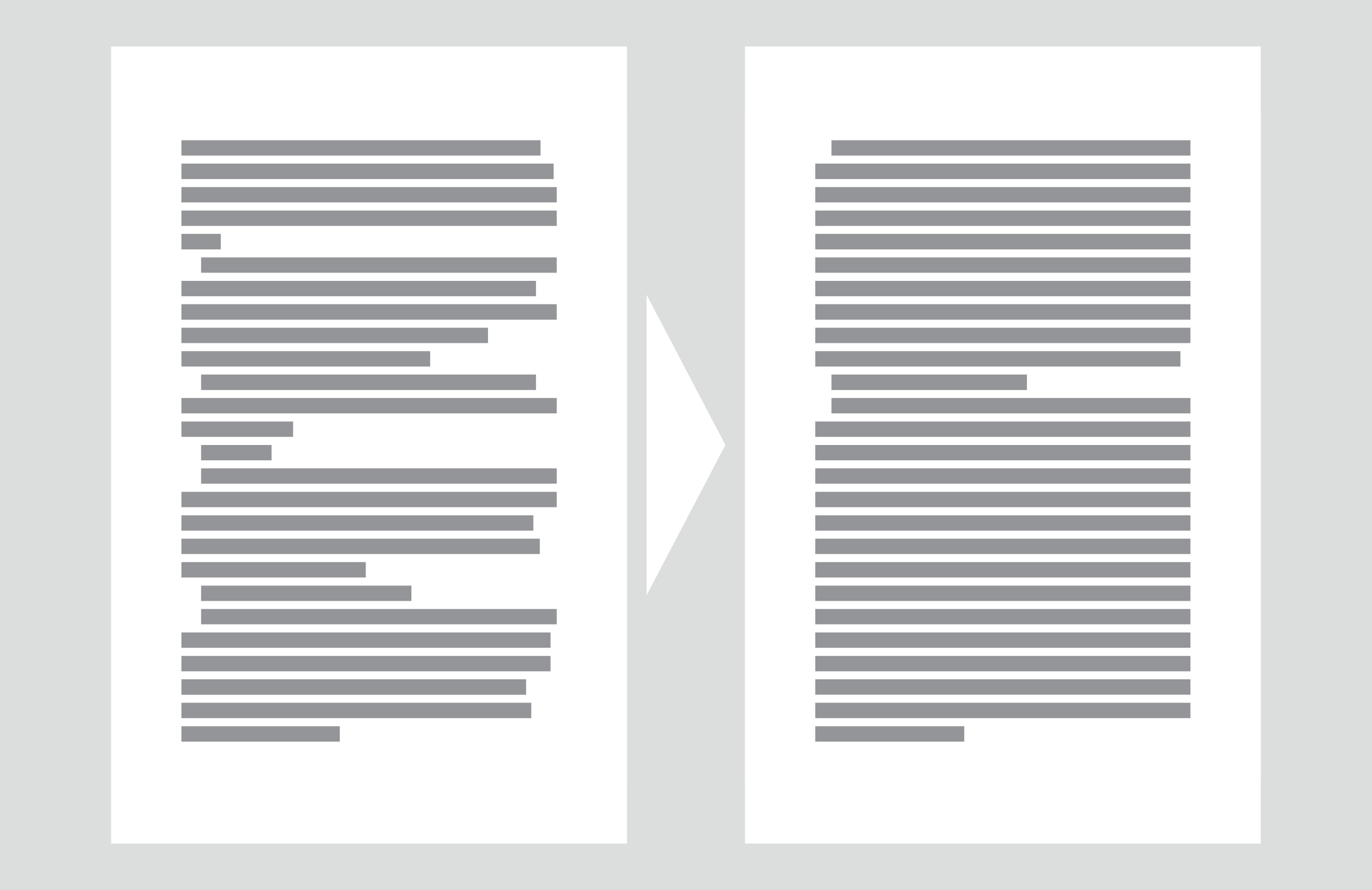
Bad formatting breaks the flow of your text.
Why it matters
Typesetting is the invisible art that determines whether your book feels professional or amateur. It influences everything from eye comfort to how seriously a reader takes your work. A poor layout can cause readers to disengage, no matter how powerful your message is.
Great typesetting creates a smooth connection between author and reader—like a clear phone call instead of one filled with static.
Why Typesetty?
Experience with complexity: Whether it’s a straightforward novel or a graphic-heavy non-fiction book, I know how to handle layouts that range from simple to intricate.
Design that reads well: I don’t just make pages look good, I make them feel good to read.
Genre-specific insight: I tailor our approach to the content, whether it's business, memoir, literary fiction, or beyond.
Technical precision: I understand the difference between typography and typesetting—and why both matter.
Avoid costly mistakes: I've seen what happens when authors go for the cheapest option. It’s not worth it. I provide professional results without the bloated price tag of big design firms.
Somebody’s got to do it.
Typesetting may not be the glamorous part of publishing, but it’s one of the most important. It takes time, skill, and a deep understanding of how design affects the reading experience.
Let us handle the invisible work that makes your book look, feel, and read like the professional piece it is.
Your words deserve it.
My CV
I’ve held a variety of professional design positions in advertising, marketing, journalism and the entertainment industry, where I’ve been responsible for delivering everything from photos to websites.
In addition, I’ve been published in Vogue and have a cover for Adweek.
I’m based in NYC, but am available to travel for longer consulting engagements.
About
All works on this site are the property of myself or my clients and are featured here with express permission.